rt and design is infamously subjective. One person’s trash can be another’s masterpiece. But luckily there is an age-old number that can help aid your designs into scientifically-proven beauty: the Golden Ratio.
Mona Lisa Golden Ratio
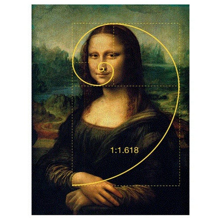
Mona Lisa Golden Ratio via Simply.Science
Have you ever secretly wondered, ‘What’s so great about the Mona Lisa?’ The answer is the Golden Ratio.
Otherwise known as The Golden Section, Golden Mean, or the Greek letter ‘phi’, the Golden Ratio is a very handy number that helps you create beautiful, perfectly balanced designs that are aesthetically satisfying on a deep cerebral level. Cool, huh?
Although art and design are often led by instinct and creativity, the Golden Ratio uses mathematics to transform your image-making, layout, typography and much more. So let’s get into it.
What is the Golden Ratio?
—
The Golden Ratio is the number used when two quantities are divided in a way that their ratio is the same as the ratio of their sum to the larger one of the two quantities. That number is 1.618, also called Phi.
illustration of a cat within golden spiral
Illustration using the golden ratio, by Vladanland
The easiest way to demonstrate this is by using the Fibonacci Sequence. Without going into too much detail, this sequence is the sum of the two numbers before it. So: 0,1,1,2,3,5,8,13,21…forever and ever (and ever). Back in the day, the Greeks used the Fibonacci Sequence to form a visual pattern to aid their designs. When you turn the sequence into squares and lay them side-by-side to create rectangles, a spiral (called the Golden Spiral) starts to form.
the golden ratio example of squares forming the golden spiral
Don’t let a few equations scare you off! The Golden Ratio is actually a lot simpler than it looks. And it’s found everywhere. The Golden Spiral appears in nature all around us. From hurricanes to flowers, galaxies to shells… and even those weird mutant cauliflowers you get at the grocery store sometimes.
romanesco broccoli
Romanesco Broccoli via The Curious Mango
golden ratio in nature
Golden Ratio in Nature by Mate Marschalko via medium
How to use the Golden Ratio in graphic design
—
One of the best things about the Golden Ratio is that it gives you a simple number to help structure the otherwise expressive nature of design. Simply multiply an element’s size by 1.618 to figure out the size of another element, or overlay the Golden Spiral to adjust their placement. You can use the Golden Ratio to guide you in your layouts, typography, imagery and more.
We’ve put together four tips and tricks for how to use the Golden Ratio to maximize scientific beauty in your designs, da Vinci style.
1. Typography hierarchy
When creating any design that uses text, always consider messaging hierarchy in your layout. Whether it’s a poster, a wedding invitation or a website layout, you can use the Golden Ratio to guide your typography sizes.
For example, let’s say when you’re working out your copy hierarchy for your really important text (A), your sort of important text (B) and your not so important text (C). If your smallest font size for (C) is 10px, then multiply that by 1.618 to get a rough guide for your larger sizes.
Secret garden poster
Beautiful midsummer poster by green in blue
gritty posters for DJ Immaculate Styles
gritty posters for DJ Immaculate Styles by nevergohungry
Outdoor film festival poster
Colorful poster for Amsterdam outdoor film festival by green in blue
2. Image composition
When considering the harmony of your images, it’s always good to stop, take a step back and come back with a fresh eye. But if you don’t have the time to ponder your works of art, a quicker alternative is the Golden Spiral. Overlay the spiral on your images to see which elements sit where, and if they really do create harmony.
Using the Golden Spiral, you can work out where focal points need to be, how to centralize a headline for maximum impact, or which elements need to be shifted to give the design more energy.
Into the wild illustration
Beautiful Into the Wild illustration by Dusan Klepic DK™
Night Sky Illustration
Night sky illustration by Alerim
Magical whale illustration
Magical whale illustration by Marrieta
3. Logo design
A well-conceived logo is vital to your brand so people can understand your core message at almost a single glance. That’s why it’s a great idea to consider the Golden Ratio when designing a logo to instantly draw people in and help them connect. In fact, many of the biggest brands in the world use the Golden Ratio to form their logos: Pepsi, Apple and Twitter to name just a few.
For example, Green in Blue’s logo for baking business ‘The Hungry Gnome’ is a perfectly balanced contemporary-kitsch logo that uses the Golden Ratio to guide image placement, and the sizing of its text.
Rahajoe’s logo for Little Spoon uses circles within the Golden Ratio as a grid to guide their design.
hungry gnome logo
Adorable baking business logo by green in blue
little spoon logo
graphic golden ratio logo by Rahajoe
When designing a logo, you can even imagine the Fibonacci sequence as a series of circles, then rearrange them to form a grid as the foundation for your logo design. This is the basis of many logos, including the Twitter bird.
fibonacci sequence circles
Fibonacci sequence show through circles by Mostafa Amin and Brandology Studio
4. Layouts
When you’re challenged with a bunch of different things in a single layout, it’s always useful to use the Golden Spiral to guide your placement of each element. We are naturally drawn to the center of the spiral, so it’s often best to place your most important message there.
summer of love poster
Beautiful retro inspired poster by green in blue
a girl like grace poster design
A girl like grace independent film poster by subsist studios
Challenges layout
Layout for Challenges by Spoon Lancer
For example, with Green in Blue’s poster design for a Summer of Love party, the spiral fits perfectly around the face and flower, making it a well-balanced and intriguing focal point.
Memorize this number: 1.618
—
This number is your new best friend. Multiply a font size or a design element by the Golden Ratio, and you’re one step closer to see your layout start coming together. Or you can always overlay the Golden Spiral as a handy guide.
Because of the scientific, even universal nature of the Golden Ratio, designers often use it whether they know it or not. However, it’s always good to check to see if your designs sit within the magic of 1.618 so you can take them to the next level of awesomeness!
Check out our Design 101 article if you want to learn more about graphic design basics.

Leave a Comment