and lettering has existed as a trend for a while. It’s wildly attractive to designers looking to express themselves creatively with text, and clients seeking a bespoke design solution that enables them to stand out.
By now it’s everywhere—you can’t go a block without seeing a chalkboard sign emblazoned with a cheeky phrase written in fancy script. And because it radiates whimsy and craftiness, hand lettering is in peak demand. All the more reason to add it to your design repertoire.
Just like every person’s handwriting is unique, whatever you end up hand lettering will be, too. There are tons of different styles and techniques to try out, all of which lend themselves to a lovely finished product. It doesn’t need to be perfect (although you might want to run a spellcheck before you start), and you don’t necessarily need a computer or tablet to do it.
So let’s jump right in. In this article, we’ll cover the basics you need to get started, and recommend a few Skillshare courses to help you hone your skills.
What is hand lettering?
_
You know how a square is technically a rectangle, but a rectangle can’t be a square?
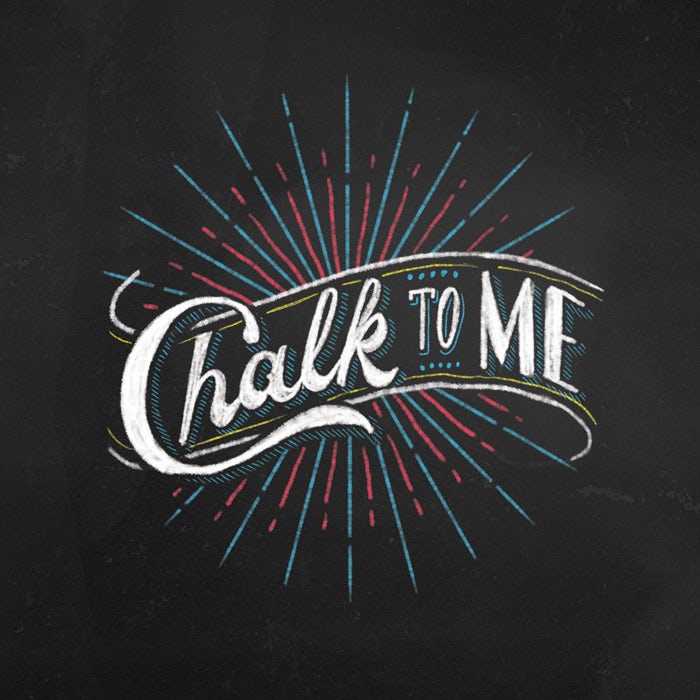
hand lettering chalk
Chalk to me! Lettering by Bramanto Setyaki
That’s kind of how it is when it comes to comparing calligraphy and hand lettering. They’re similar, but hand lettering is more akin to the scrappy little cousin of calligraphy. Where calligraphy is precise, hand lettering is a bit more loose and graphic.
The terms can be used interchangeably, and people often do. But hand lettering looks particularly amazing when used as a key graphic: on message boards, posters, book covers, menus and any large-scale applications.
It doesn’t take much to get started. When gathering your supplies, you can use anything you have around the house to create your masterpiece. Chalk, markers, ink, gel pens—anything that can make a mark functions as a medium. Computer paper works just as well as fancy cardstock. Feel free to experiment with different utensils and materials until you find whatever works best for your vision.
1. Lay the right foundation
_
Quote hand lettering design
Simple, elegant and all lettered by hand. Design by Mky
If you have zero lettering experience, sharpen your pencil and start with Mary Kate McDevitt’s foundation class. Over 58,000 Skillshare students (and counting) have taken it since it launched, and it comes with plenty of useful links and resources to support you along your hand lettering journey.
You’ll start from square one with concepting and ideation, learning strategies for picking a meaningful phrase to illustrate. After you gather your references and create a mood board, you’ll figure out which tools to use and different techniques for actually producing your final project.
Practice is, as you know, the most important thing when it comes to mastering any technique. And hand lettering is no different. So rather than diving right into the final project, you’re encouraged to complete a series of warm-ups to perfect skills like creating guidelines, setting up layouts, developing a writing style, drawing drop shadows and inking delicate details.
Class recommendation: Hand Lettering Essentials for Beginners
2. Start with something small
_
Graphite hand lettering sketch
All you need is a pencil and paper to get started. Lettering by Bramanto Setyaki
Once you’ve got the basics down, apply your skills to a small-scale project. Designing an individual greeting or postcard will inspire you to focus on turning a text into a composition, and how it flows within a set space.
Martina Flor’s postcard design course is great for this. The pro letterer takes her pupils through the hand lettering process from A to Z. Starting with an introduction to what, exactly, hand lettering is, she goes into more detail about the nuances that separate it from calligraphy and type design.
But it’s not just about the finished product. Martina will teach you how to train your typographic eye to the point that you’ll see inspiration wherever you go. You’ll also learn how to approach simple combinations of shapes, color and typography to express complex messages and emotions.
By the end of the course, you’ll understand how to take your drawing from paper to screen, techniques for adding color and texture in lettering, and the correct methods of printing your postcard. As a bonus, you’ll have expanded your skills in Illustrator.
Class recommendation: The Golden Secrets of Hand-Lettering – Create the Perfect Postcard
3. Combine illustration and lettering
_
hand lettered poster
Beachy illustration meets playful typography in this poster by María Vargas
Your existing affinity for design will make your developed hand-lettering style that much more personal. By now you should be comfortable with different new techniques and tools. It’s the perfect time to take what you already know and incorporate your other creative skills in your practice, to come up with something entirely new.
This 35-minute course revisits useful techniques for gathering inspiration and teaches three unique approaches for combining illustration with hand lettering.
Although it’s for all levels, intermediate and advanced students will enjoy the challenge of turning their favorite animal into a gorgeous poster, card or print.
Class recommendation: Hand-Lettering Workshop – Illustrating with Lettering
4. Experiment with different styles
_
Attention to detail (and your own style) is everything when it comes to going pro. While having a solid overview of a skill is perfectly acceptable, truly mastering a skill means getting meticulous.
A great way to do that is by focusing on one single letter at a time. That gives you 26+ opportunities to try out a different look and tell a different story with every glyph.
Three distinct hand lettering styles, all by Dalibass
This is the basis of an intermediate course taught by accomplished letterer Jessica Hische. It has students focus on creating one letter only. You’ll learn Hische’s personal lettering process, as well as tricks for sketching out solid designs, digitizing your work and dissecting letterforms.
You’ll also learn how to critique your own work and push yourself to create the best possible finished design—whether you decide to go with a vintage, modern, abstract or just plain funky character.
Class recommendation: Lettering for Designers – One Drop Cap Letterform at a Time

Leave a Comment